This week I have been exploring the website from my local public library, The Eastern Regional Library website, located at https://www.yourlibrary.com.au/.
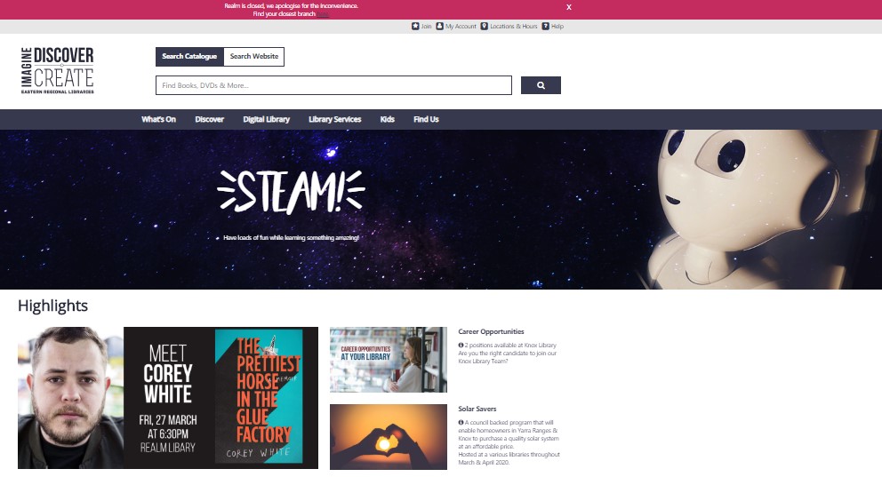
The Eastern Regional Library site uses an ambiguous organisation scheme, with several well labelled bars. A number of which cover topical subject aspects such as, listing the variety of Services and Resources they offer. Their audience is specific to the local community, and their website supports them with a few task orientated functions such as: getting a Membership and searching the catalogue. Many of their links are labelled as Gambrell (2015) describes as the most common top navigation terms such as: Search, Services, About Us, Help and My Account.
While predominately a broad and shallow hierarchy website structure, there is one tab, the Library services tab, which has 12 menu items, some on which also have a third layer of choices. While this tab has a vast amount of important information it is organised alphabetically. For a list this long I would prefer to see it listed from the most to least popular for a faster and user-friendly navigation.
The site can be translated into many different languages, although the location of this facility is not prominent, but rather hidden at the bottom right hand corner of the home page. They also clearly lay out in a table hard copy books and their availability at each locality. Photos are appropriately tagged, although some are tagged with different “labels” that are official language rather than the more user-friendly text on the photo. The site is well spaced out and uncluttered allowing for easier accurate selection when using buttons to make selections. Their help link went to a variety of methods of contact, both online and by phone as well as a list of well laid out topical FAQ’s assisting a diverse range of patrons.
(Eastern regional Library, 2020)
What works:
Gambrell (2015) suggests that website users now have the expectation for a single “Google type” search box. As the Search function is the primary action a user takes on the library website the Eastern Regional Library has made their search box prominent on the home page. For me this is where Eastern Regional Library website excels, they have executed this extremely well, keeping navigation simple, and providing an easily found, large, dual-purpose bar supporting transferring between searching their site and their catalogue in a visually appealing simple way.
- I love the prominent position and strong use of colour for the closure of the largest branch and link to more information (pinned to the top)
- They have well placed links to join, login to account, location and hours and help
- They feature high priority marketing in a prime location
- They have separated their search into 4 main community area including, e and audio books, children, resources (books, dvds, games) and family history in prominent well labelled buttons (which are also links) to guide their patrons.
- Towards the bottom of the home page they offer quick visual links to popular resources (with a well-placed reminder that they can be placed on hold)
- Opportunity to subscribe to their newsletter
- Then great links to paperwork, popular activities, social media connections and other council-based resources. Linking a library’s website to their council’s homepage is a real must if your website is to be useable. (Scheeren, 2015).
What doesn’t work:
Unfortunately, the well placed and designed link to the closure of their largest library transferred their users to an older page which had not been updated with the branch’s new information. They should keep their website up to date and always have the most recent update date on the page (Scheeren, 2015).

(Eastern regional Library, 2020)
Suggest improvements:
- The tabs bar has the space to spread out the tab titles, also making them larger would be beneficial to older or visually impaired patrons.
- While a library has many functions and resources, I always prefer to see library related photos (of books, the facilities etc) rather than the prominent photo they have included which refers to writing.
- Not so much in layout but for accessibility, adult patrons can easily join online however those patrons aged under 18 cannot join online (and their parent/ guardian can also not join them up online), but rather they need to visit the library in person. This could limit the opportunity for younger patrons to access the many wonderful opportunities their local library has to offer them, which is disappointing.
Overall, I found the Eastern Regional Library website very user friendly, filled with readily accessible, mostly current, commonly sort after aspects of the library that their patrons would benefit from having access to online.
References:
Eastern regional Library. (2020). Retrieved from https://www.yourlibrary.com.au/
Gambrell, K. (2015). 7 best practices for creating a user friendly library website. Retrieved from https://www.ebsco.com/blog/article/7-best-practices-for-creating-a-user-friendly-library-website
Scheeren, W. (2015). Technology Handbook for School Librarians. ABC-CLIO.
